Patterns, colours, and room-by-room advice for Australia's most loved architectural style.
What makes Federation homes distinctive?
Federation homes, built between 1890 and 1915, are one of Australia's most enduring and widely renovated architectural styles. Less formal than their Victorian predecessors, they are characterised by red or dark-brown brick facades, generous verandahs, ornate timber fretwork, leadlight windows, and roofs in terracotta, slate, or corrugated iron. The Arts and Crafts movement was a strong influence — natural materials, earthy colours, and handcrafted detail are hallmarks of the style.
Decorative tiles were a key element of Federation design, used on pathways, verandahs, and throughout the interior. Choosing the right tiles — in terms of both pattern and colour — is one of the most effective ways to honour a Federation home's original character, or to give it a considered contemporary update.
What colours and patterns suit a Federation home?
DFederation tile palettes are earthy and restrained compared to the vivid colours of the Victorian era. The dominant tones are brown, leaf green, rust, putty, ochre, burgundy, cream, and shades of grey — colours drawn from the Australian landscape and the Arts and Crafts tradition. Three or four tonal shades of a single colour, creating subtle depth, are characteristic of Federation floors.
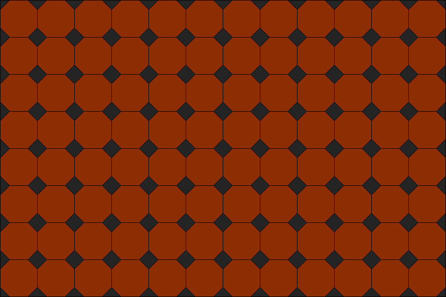
Patterns are moderately complex — less ornate than Victorian, but still geometric and multi-piece. The octagon and dot pattern came to prominence during this period and remains the most recognisable Federation tile pattern in Australia. Borders are standard; panels and encaustic inserts were common on verandahs and pathways.
-
Earthy Colours
Replace vivid colours with Australiana earthy colours and subtle tonal harmony. -
Modestly complex patterns
Slightly less complex than Victorian, with the Octagon & Dot surging in popularity in this period. -
Single-Coloured Encaustics
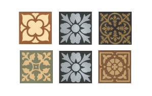
The use of single coloured encaustics (e.g. black on white) endured well into the first decade, but not multi-coloured encaustics.
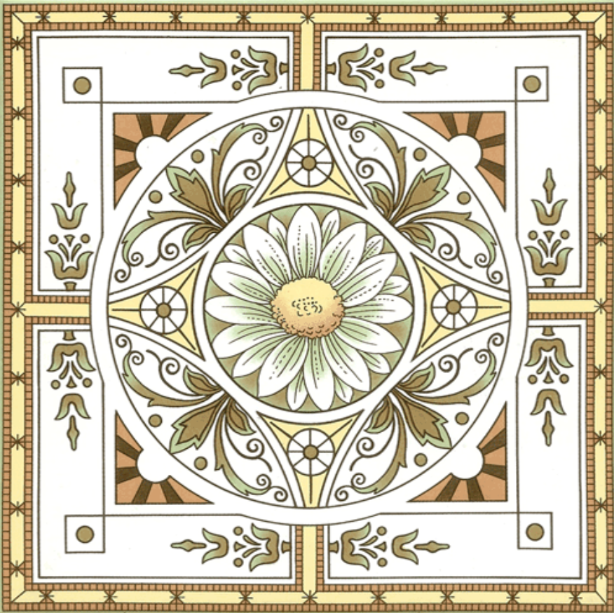
Encaustic tiles continued to be used in Federation homes, but in single colours only — typically black on white — rather than the multi-coloured encaustics of the Victorian era. Decorative wall tiles with floral and botanical motifs, inspired by the Australian landscape, were used at fireplaces, on stair treads, and in bathrooms.
What tiles suit a Federation verandah or front pathway?
A tessellated-tile front path leading from the gate to the front door, paired with a matching or harmonising verandah floor, is one of the defining features of a Federation home. This is where tile choice has the greatest visual impact — it sets the character of the whole house from the street.

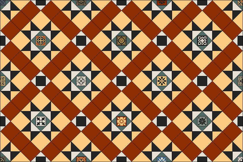
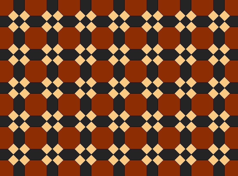
For a historically authentic result, choose tiles in heritage colours that complement a red or brown brick facade: burgundy, russet, rich forest green, cream, and oatmeal are all well-suited. The octagon and dot pattern is the most period-appropriate choice for Federation verandahs; the York, Raglan, Annandale, Leeds, and Windsor patterns are also characteristic of the era. Adding single-colour encaustics — black dots on a cream field, for example — as inserts within the pattern is a traditional detail that reads as genuinely authentic.


For a more contemporary take, simplify the layout, reduce the ornamentation, and select a pared-back palette of three or four warm neutrals — charcoal, taupe, and brown work well. This acknowledges the heritage of the home without reproducing it literally.

When choosing tiles for an exterior, always factor in the full facade: the brick or render colour, any leadlight windows, fretwork, and metalwork. Picking up one or two colours from these existing details creates a cohesive, considered result.

For heavily trafficked exterior areas, fully vitrified porcelain tiles are the appropriate choice — they are slip-resistant, water-resistant, and will not stain or fade.
What tiles suit a Federation living room?
Federation living rooms often contain significant period features — decorative cornices, timber floors, built-in cabinetry, and, most prominently, the fireplace. Tiles play a supporting role here: they should complement the existing architectural detail rather than compete with it.
The fireplace is the most natural place for decorative tiles in a Federation living room. A bold tiled surround and hearth — using decorative tiles with floral or botanical motifs in warm, natural colours — is a period-authentic treatment. For a more contemporary approach, keep the surrounding walls and trims white or neutral and pick up the tile tones in a rug or soft furnishings.

For tiled floors in a Federation living room, a tessellated pattern with single-colour encaustics in a light tonal shade works well, particularly where leadlight windows introduce colour into the space — picking up one of those colours in the floor ties the room together. A simple tiled border can define the floor area in a way that references the look of a rug.
Keep the rest of the room uncluttered. Block-colour upholstery and breathing space around furniture allow the decorative features to read clearly.
What tiles suit a Federation bathroom?
Federation bathrooms are one of the most common renovation projects we work on, and the approach here is usually more contemporary than in other parts of the home. Traditional tessellated floors are largely reserved for the verandah and front path — in the bathroom, most people want something that feels fresh and liveable while still being sympathetic to the period.


Mosaic tiles are the most popular choice for Federation bathrooms, and for good reason. Small-format mosaics — particularly in hex or penny round formats — have genuine historical precedent in Federation and Edwardian bathrooms, and they read as both period-appropriate and contemporary at the same time. A 25mm or 50mm hex mosaic floor in a Federation-friendly palette (cream, dusty white, warm grey, or soft taupe, with a darker grout to define the pattern) is one of the most versatile and enduring choices for this style of home.
For walls, classic subway tiles are the most period-appropriate choice — white or cream, in a brick or stacked layout. A feature border of glazed embossed tiles or decorative screen-print tiles at the top of the subway tile run adds a Federation-era detail that is both authentic and practical.


For a more contemporary Federation bathroom, pair the period architectural features with a streamlined modern bathtub and vanity in plain white. A mosaic floor in a bolder palette — chosen from the Winckelmans range of 32 plain and 7 speckled colours — with brass or brushed gold tapware creates a result that feels current but remains grounded in the heritage of the home.

If you do want a traditional tessellated floor in a Federation bathroom, a pattern in earthy heritage colours — brown and burgundy with accents of black and cream — pairs well with period fixtures such as a clawfoot bath or vintage-style vanity. If the floor is dark, balance it with pale wall tiles and light ceiling colour to maximise light.
As with any wet area, choose tiles that are water-resistant and slip-rated for the application.
What tiles suit a Federation kitchen or laundry?
Federation kitchens and laundries were functional spaces, but tiles were still used for both practical and decorative purposes — on floors, splashbacks, and occasionally as full wall coverings.
For floors, a simple tessellated pattern in Federation colours is appropriate and durable. For splashbacks and walls, subway tiles in cream, white, or soft neutrals are the most period-sympathetic choice. A decorative border tile or a run of heritage wall tiles with botanical motifs adds character without overwhelming a working kitchen.
In the laundry — a dedicated room in most Federation homes — a tessellated floor in a practical, easy-to-clean pattern is both historically accurate and highly functional. Simple patterns in two or three colours work well in smaller laundry spaces.
Heritage restoration vs contemporary update: which approach is right for my Federation home?
Both are valid, and the choice depends on the condition of the existing tiles, any heritage overlay requirements, and your own preferences.
Restoration — returning the home to its original tile scheme as closely as possible — is the appropriate approach for homes under a heritage overlay, or where original tiles survive and can be matched. Olde English Tiles works with the Winckelmans colour range, which has remained largely consistent since the tiles were first introduced to Australia in the 1880s, making accurate colour-matching possible in most cases.
A contemporary update — using Federation-era patterns and forms but with an updated palette or simplified layout — allows more design freedom and can produce a result that feels current while remaining sympathetic to the home's character. This is the most common approach in renovation projects where the original tiles are gone and the brief is to create a cohesive, heritage-influenced result rather than a strict reproduction.
If your home has a heritage overlay, check with your local council before making tile decisions — some overlays require like-for-like restoration rather than renovation.
Shop tiles featured in the article
If you’ve spotted a tile design or pattern that takes your fancy, check out the quick links below to each of our collection pages. Still have questions? Make contact today to discuss the vision for your Federation project.
Floor Tiles

Wall Tiles