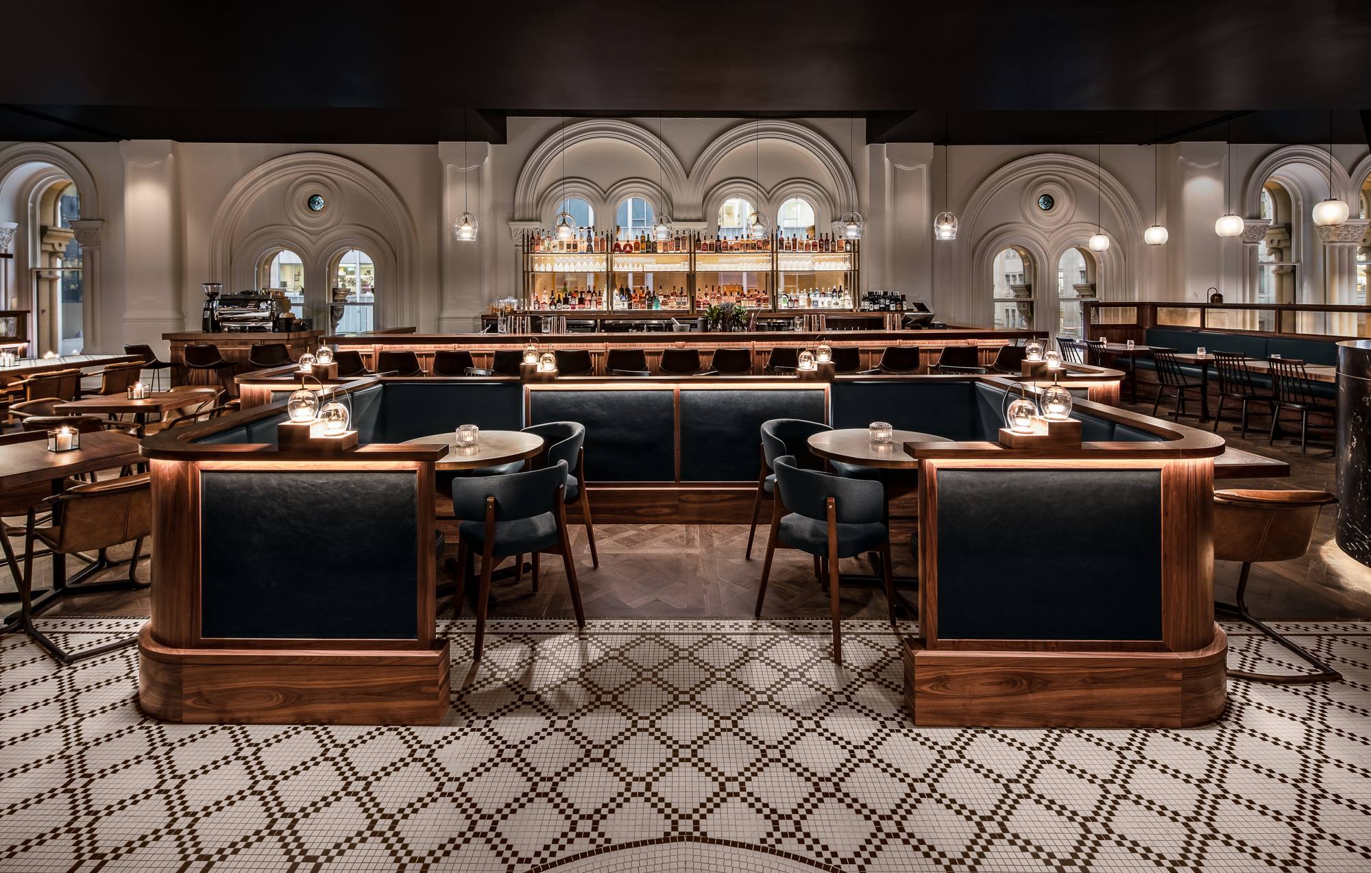
We sat down with Guru Project employee Kathryn Ashley (the talent behind Kathryn Ashley Design ) to talk about the fit out and mosaic tiles at Esquire Drink & Dine - a lavish new establishment at Sydney’s QVB.
Can you please give us a quick introduction of yourself and Kathryn Ashley Studio?
Sure - I'm Kathryn, and I'm an interior designer specialising in hospitality + retail design. It has been the focus of my career since I finished university and fell in love with it during my first design role, just over 10 years ago now. I've been incredibly fortunate to work with and learn from some of the top hospitality designers over the years, and have just stepped out on my own and launched Kathryn Ashley Studio, where I offer clients my experience and skills in a dedicated, hands on role. Esquire was completed during my employment with Guru Projects.
Can you share the inspiration for the fit out at Esquire Drink & Dine?
The brief we received from the client for Esquire was to create a busy and bustling dining room and bar reflective of a late night supper club. The concept combined the mysterious and cinematic aesthetic of film noir with the comforting warmth and excited buzz of the speakeasy. The existing heritage features made a fantastic backdrop from which to build bar and kitchen theatre, a feature wine cellar and intimate dining spaces dressed in rich timber, dark marbles, leather, velvet and of course the beautiful feature mosaic tiles.

Were there any important factors you had to consider when choosing tiles for the project?
Aesthetically and from the concept we developed the tiles needed to inject pattern and fun but keep in line with the balance we were creating between vintage and contemporary.
Compliance considerations of course meant sourcing floor tiles that met the appropriate slip ratings for restaurant use.
Why did you decide to use the Astoria 20 mosaic pattern around the bar and on the restaurant floor?
I knew the Astoria 20 mosaic pattern was the right fit from the moment I saw it. The classic black and white (off white) mosaics suited our palette perfectly, especially with their matte finish. And the pattern was clean lined and interesting without being overpowering, yet demanding just enough interest.
Utilising the mosaic at the entry and around the bar was a way to define these spaces, to lift the floor from being too dark and to add interest to the layered textures in the space.


Are there any other shapes, colours or patterns from Olde English Tiles that you’d like to use in future projects?
There are so many different products from Olde English Tiles I would love to use in future projects - you're actually one of my go to websites even just for inspiration. The tessellated tile patterns - a favourite of mine being the Fitzroy tessellated pattern - I just love, especially when playing with the colour palettes to switch between and bolder or more subtle effect.


Feeling inspired? Chat to us today about a mosaic pattern for your project.
