If you own a period home and you plan to purchase new tiles, it is worth starting off by asking yourself, “Do I intend to restore or renovate this area?” Nowadays, restoration is far less popular than it was, but there are still those who appreciate the decorative richness of period houses.
Ask yourself where on the spectrum from ‘authentic restoration’ to ‘gutting the interior’ you fall? Many customers express the desire to renovate by acknowledging the style and vintage of the property but without replicating the original details, e.g. using tessellated or mosaic tiles for the bathroom floor - but not using heritage colours, or using hand-made subway tiles in an unconventional colour. If you understand what the rules are, you will know how to bend or break them to achieve the best result.
Whether a traditional house or a mid-century apartment, the key is to 'keep it simple’, remembering that simple is not the opposite of bold; simple is the opposite of complicated, and dull is the opposite of bold.
Below are some guidelines and factors to consider to help you choose the right tiles for your period home.
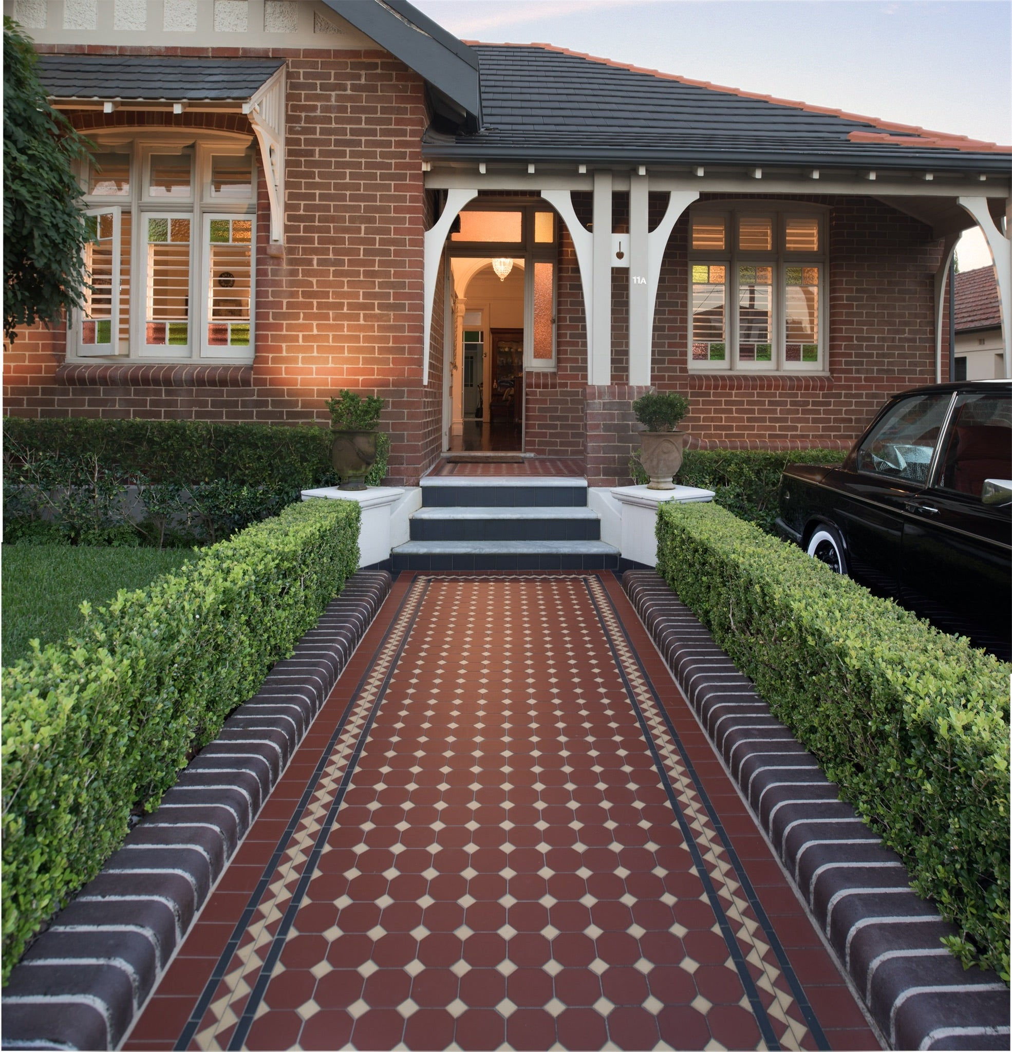
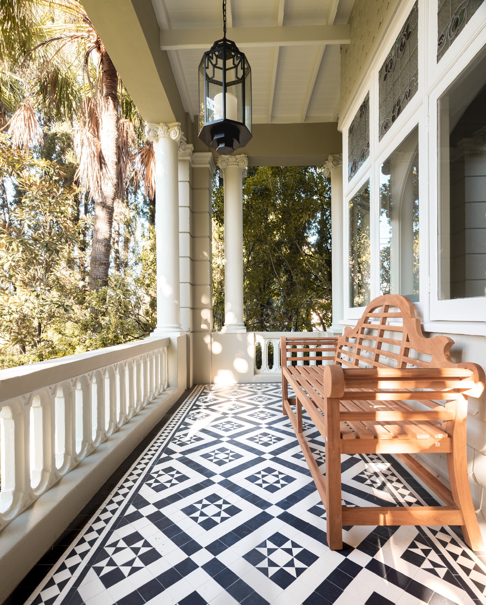
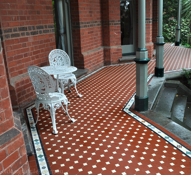
Path/Verandah:
These areas have a complex identity. They are viewed as an extension of the architectural style of the building but outside of it and part of the garden; they are permanent features, but located in a natural environment that is ever changing. Being elaborately coloured and patterned, tessellated paths have to co-exist with the colours and patterns of the flowers, shrubs and trees that frame them.
The path and verandah are also transition points between the outside, public world and your internal, private world. It is worth noting that these areas are typically restored so as to be era friendly.
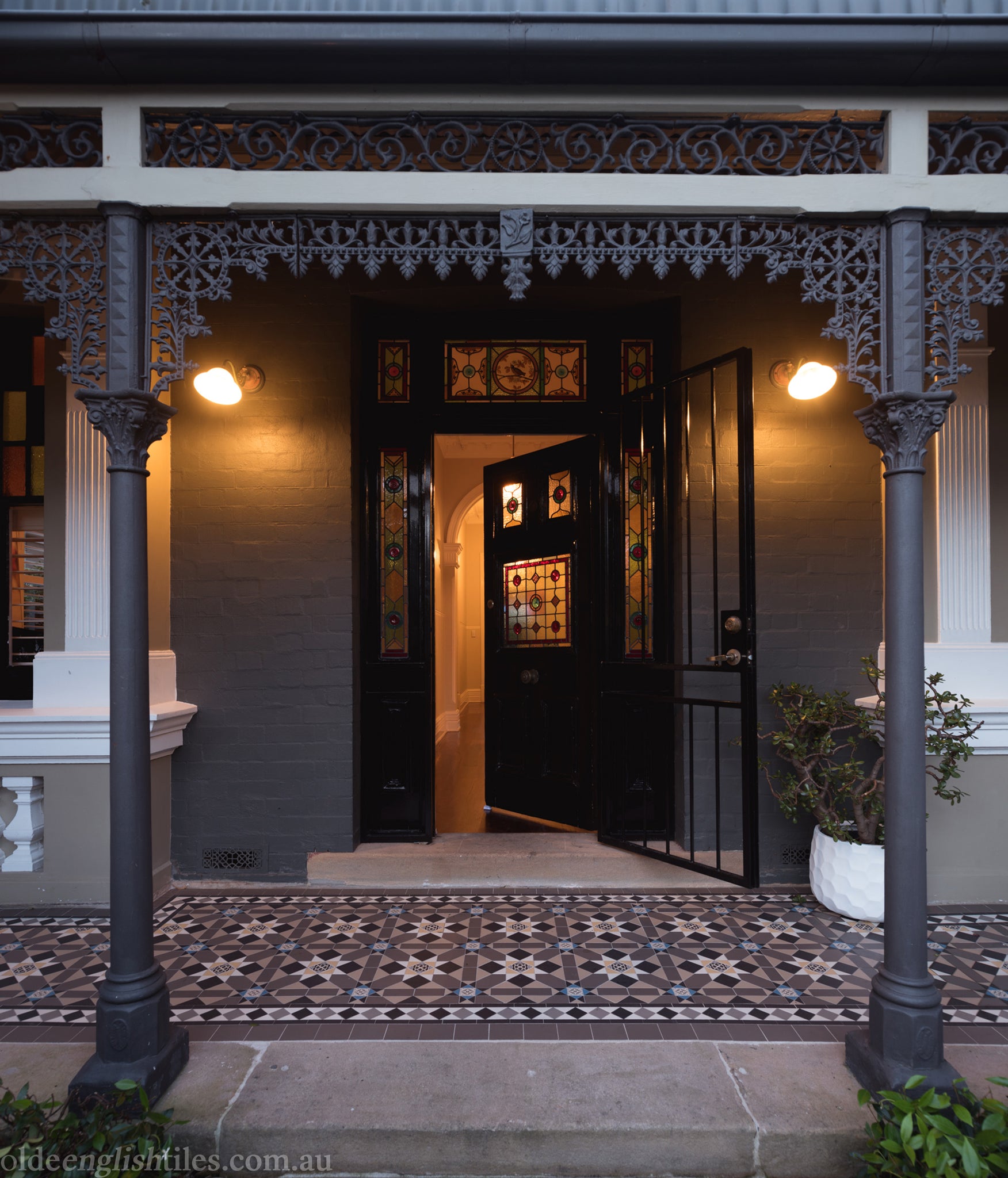
Path/Verandah: Victorian Architecture
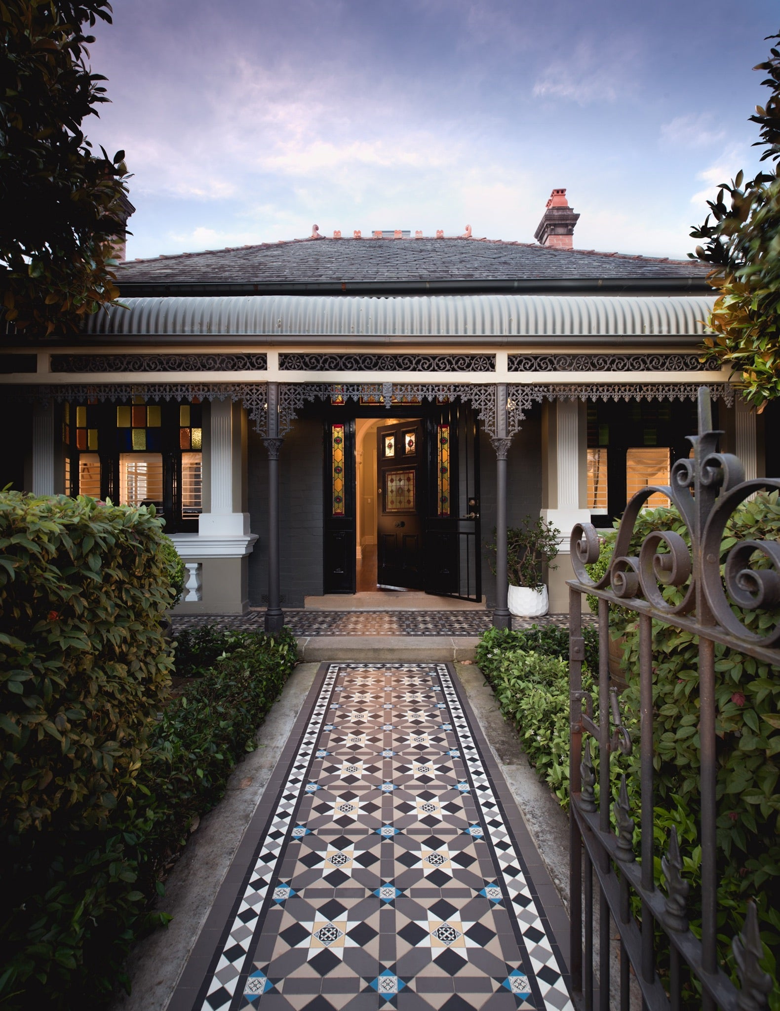
Simple, classical geometric patterns (Bath, Olde English 100) are particularly well suited to a wide variety of Victorian architecture, especially pre & early Victorian. More complex tessellated patterns featuring encaustic tiles, such as the Fitzroy, Manchester and York, are suited to High Victorian (Italianate & Free Gothic).
Colours are predominantly earthy (buff, clay, donkey brown, iron oxide red, dark brown) with highlights of black and white, plus the restrained use of deep sky blue, which adds a flash of drama to the otherwise muddy colour scheme.
Medieval inspired encaustics became increasingly popular as a decorative element of Free Gothic tessellated floors. These floors were just as commonly used on the paths, verandahs and interiors of Italianate & Free Classical/Boom Style buildings. In the latter case, tessellated floors often featured bright, non-earthy colours such as blue, aqua, green, pink & mauve as well as the more traditional colours of the earlier era.
Path/Verandah: Federation Homes
Can be divided into three main types - Queen Anne, Arts & Crafts & Bungalow style. Federation style is a blending of these styles combined with some distinctively Australian elements.
Tessellated paths of Federation ‘Arts & Crafts’ homes, while still exhibiting elaborate patterns, were less likely to employ the vivid, ‘unnatural’, non-earthy blues and greens, etc so popular a mere decade earlier. Asymmetry was a key feature of the architecture of this period, from the bay windows and winding pathways to the organic shapes of the verandah fretwork, reaching its peak expression in the Art Nouveau style whiplash curves used to depict Australian flora & fauna. Perhaps the most enduring example of this can be seen in the embossed riser tiles used on the steps leading to the verandah, or as panels between the front windows of the house, and around fireplaces.
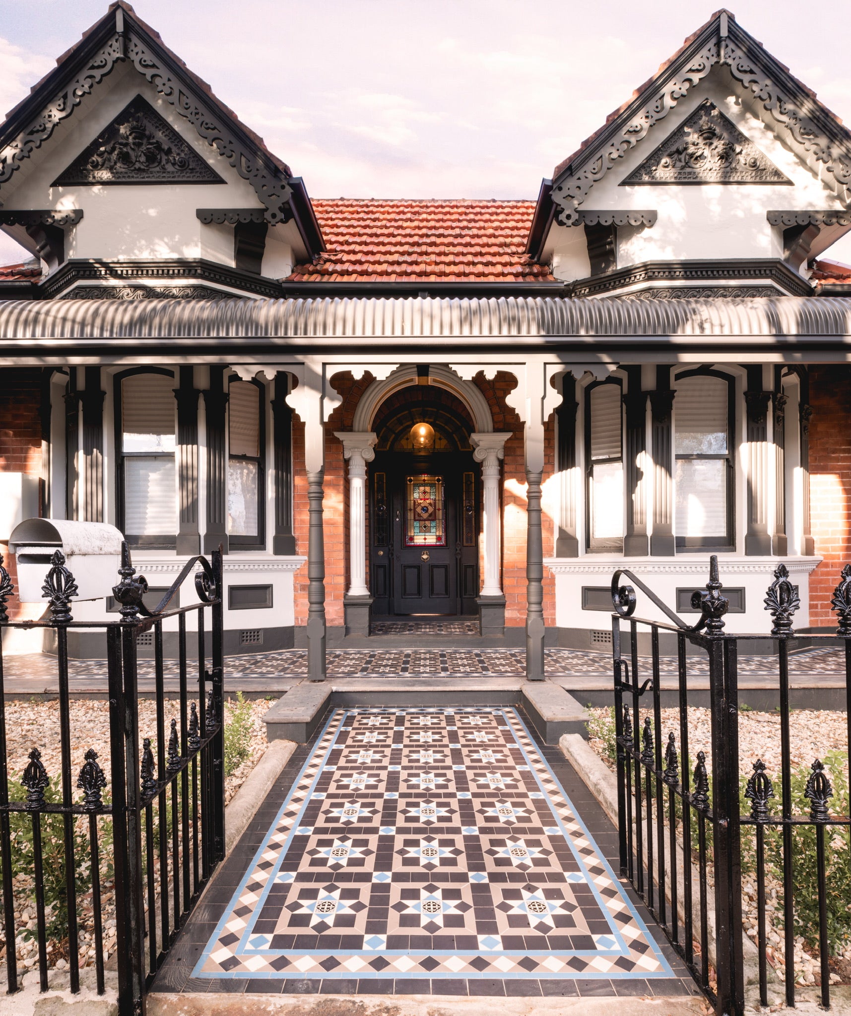
Larger scale Federation houses or those located on a corner block will frequently have a curving path, so patterns with a small scale repeat such as a Glasgow, Brighton, Nottingham or Windsor are more appropriate choices, as they are easier to lay. Federation homes on a more modest scale are well served by either simple, small scale patterns, e.g. an Olde English 100 or Raglan pattern framed by a Norwood or Balmain border.
Path/Verandah: Inter-War Styles (California Bungalow and Art Deco)
What is true for Federation Bungalows is equally true for California Bungalows, where the paths are usually shorter and the enclosed verandahs often have a curved front. Tessellated floors became chromatically restrained, resulting in a subtle, tone on tone effect - oxide red, dark brown, donkey brown, oatmeal, and cream, and geometrically simpler - Killara, Stanmore, Nottingham, Olde English 100, Raglan, herringbone and hexagon. The Norwood, Balmain, Deco and Bristol borders were the most commonly chosen.
In architectural terms, Art Deco was most commonly employed for high-rise apartments and commercial buildings. Apartments were constructed of dark brick featuring elaborate tapestry brick patterns. Faience - glazed terracotta, was particularly popular as a facade cladding for up-market residential apartment blocks. Such apartments tend to feature tapestry mosaics, multi-coloured terrazzo or simple tessellated patterns - herringbone, hexagon, Olde English 100 or similar, in colours that coordinate with the dark brick facade.
The other style of apartment architecture favoured during this period was classical, with Georgian overtones. Porcelain mosaics displaying classical patterns were commonly used - white hexagons for the main body, frequently with black rosettes or random speckles, framed by a Greek Key or Dentil border in black & white. Other patterns - Monte Carlo, Antibes and penny rounds.
Streamline Moderne, sometimes referred to as ‘Ocean Liner’ style can be viewed as the final phase of Art Deco. Pathways, porches and terraces were tiled in simple square porcelain tiles in speckled pastels, mosaics and terrazzo.
Entrance/Hallway:
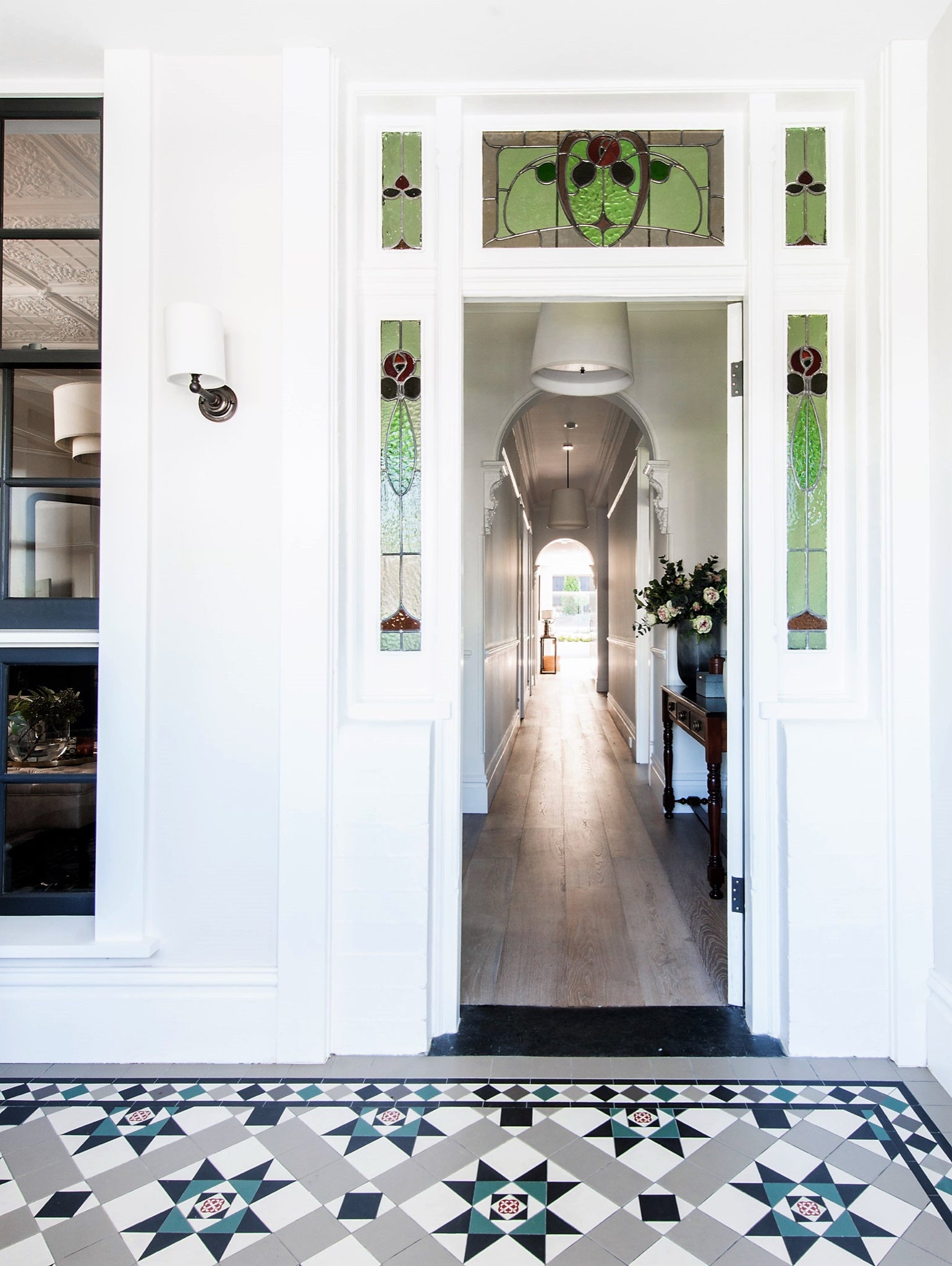
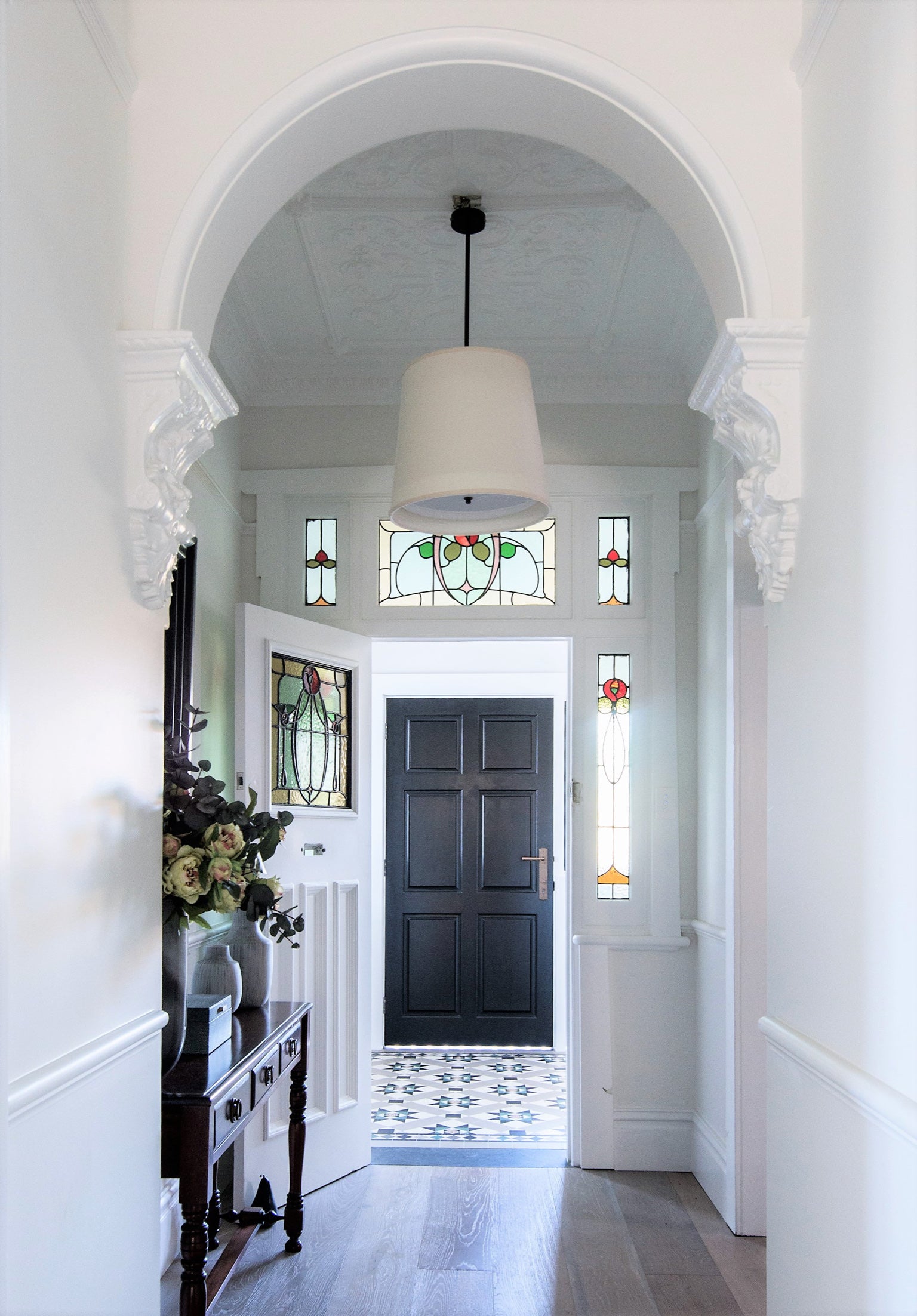
There is a need to coordinate the floor pattern of the entrance with the architectural and decorative elements of the interior. When choosing a pattern consider the shape and size of the room and the scale of the pattern being employed. It is highly advisable that patterns are laid on the diagonal. Not only does the diagonal line make the room look wider, but it draws the eye forward into the room thereby creating a more inviting and dynamic space.
In terms of appropriate patterns and colours, the information relating to pathways & verandahs is valid. The only differences worth bearing in mind are that lighter colours may be preferred due to the amount of available light, and the overall colour scheme of the interior of the house will be a determining factor.
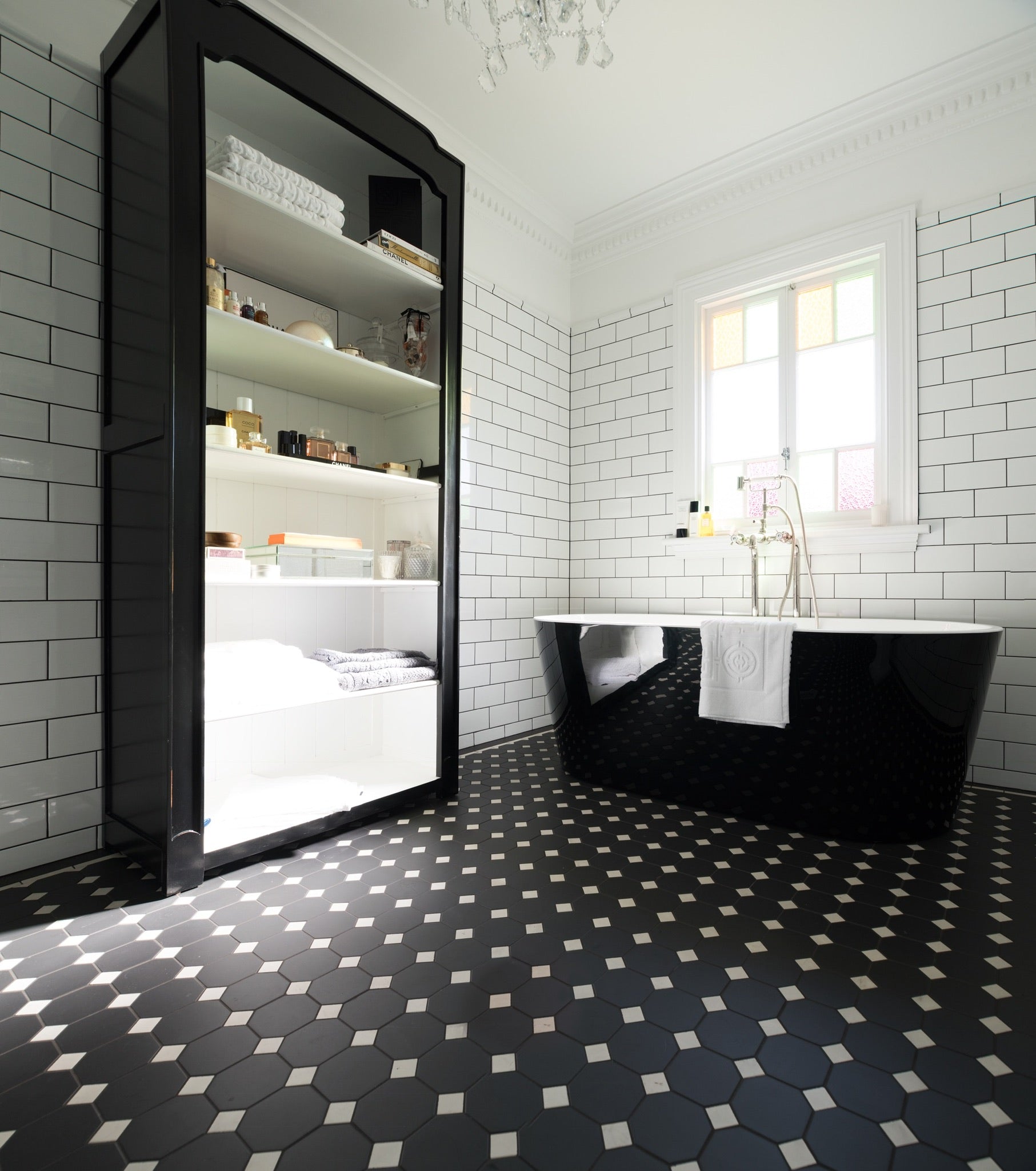
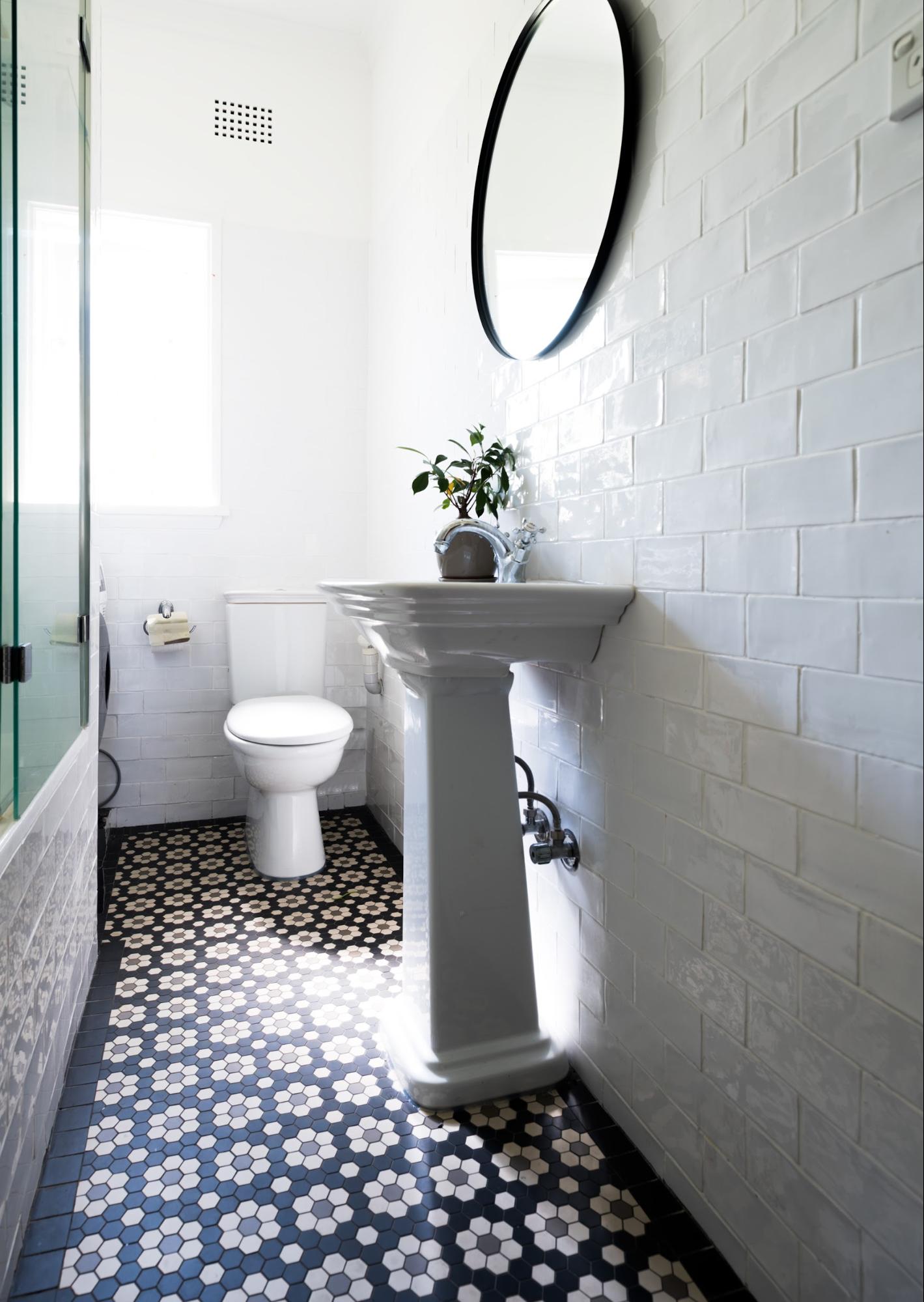
Bathroom/En-Suite:
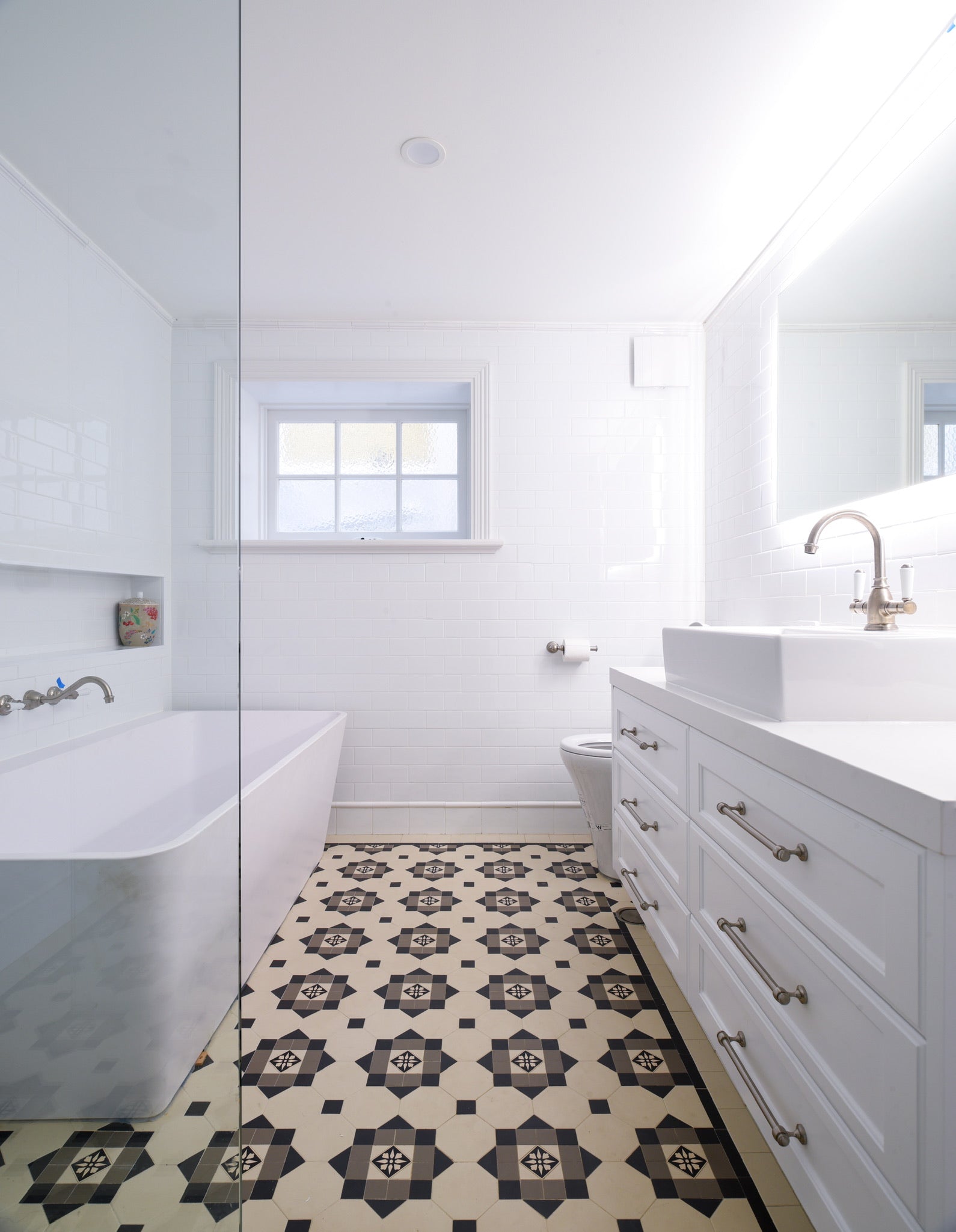
There is no right or wrong way when it comes to style, but there are some practical and technical points to consider apart from issues of safety and light. If the house or apartment is traditional, do you want the bathroom to reflect that style or simply acknowledge it in some subtle way? Is the bathroom being used by several people of varying ages or just one person where only their taste will be expressed? Remember, simplicity is the key.
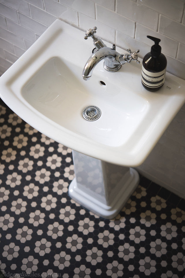
Most bathrooms in traditional houses and early 20th century apartments have a small footprint; some may have a bath in an awkward spot, so choose a pattern that is appropriate in scale and layout to the room - something small (mosaic) to mid-sized.
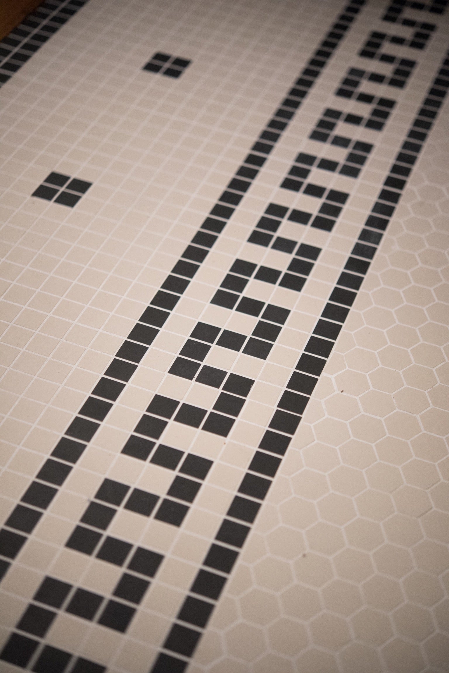
One of the many virtues of using mosaics is that they can be laid over an existing floor, particularly useful if you live in an apartment, and they are inherently slip-resistant because of all the grout.
If there is limited natural light, choose white or pastel colours, especially for the walls. Light colours reflect more light, whereas dark colours absorb light. If you have a decent sized bathroom, with large windows and a generous amount of light, you can consider a darker floor. There’s a myth that dark floors make the room look small - because dark colours come towards you. Whilst true for walls, it is not the case for floors to anywhere near the same degree. If your bathroom floor is dark but your walls are light, the dark floor will merely have the effect of defining the space e.g. a long narrow room, or a big square room with one carved wall, etc. As long as the walls are light the room will not look small.
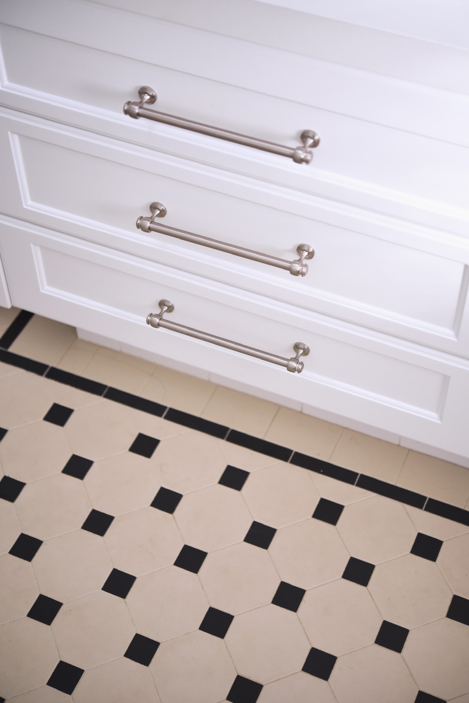
Depending on the home-owner’s budget, tessellated floors were employed on bathroom floors, combined with complex wall tile programmes that resembled the wallpaper treatments in the main living areas of the home, i.e. dividing the wall into three separate sections: patterned square tiles from floor to dado height + frieze & capping, a different shaped/patterned tile up to a wide frieze near the ceiling. Base wall tiles were usually 150x150mm square.
By the Federation period, wall tiles had become 150x75mm and the overall composition of the wall treatment was much simpler - plain subway tiles topped by a frieze and capping tile in a contrasting colour. Floors were either tessellated using simple patterns such as an Olde English 100 in black & white or blue & white, or white hexagonal mosaics with a simple border. Again, in the majority of cases the contrasting colour was either black or blue. This formula continued into the early post war period of California Bungalows and Deco apartments.
By the late 1920’s bathroom walls had reverted back to the 150x150mm or 100x100mm size in colours of mottled cream, beige or pale green, accented with a thin, tube-line patterned strip tile in shades of green, orange and black. No longer did tiles necessarily go all the way to the ceiling. Floors were still tiled with white hexagonal or square mosaics, speckled ‘tapestry’ mosaics in a herringbone or square configuration, or 100x100mm speckled porcelain tiles. Terrazzo was also a popular material for the bathrooms of the more affluent.
Kitchen:
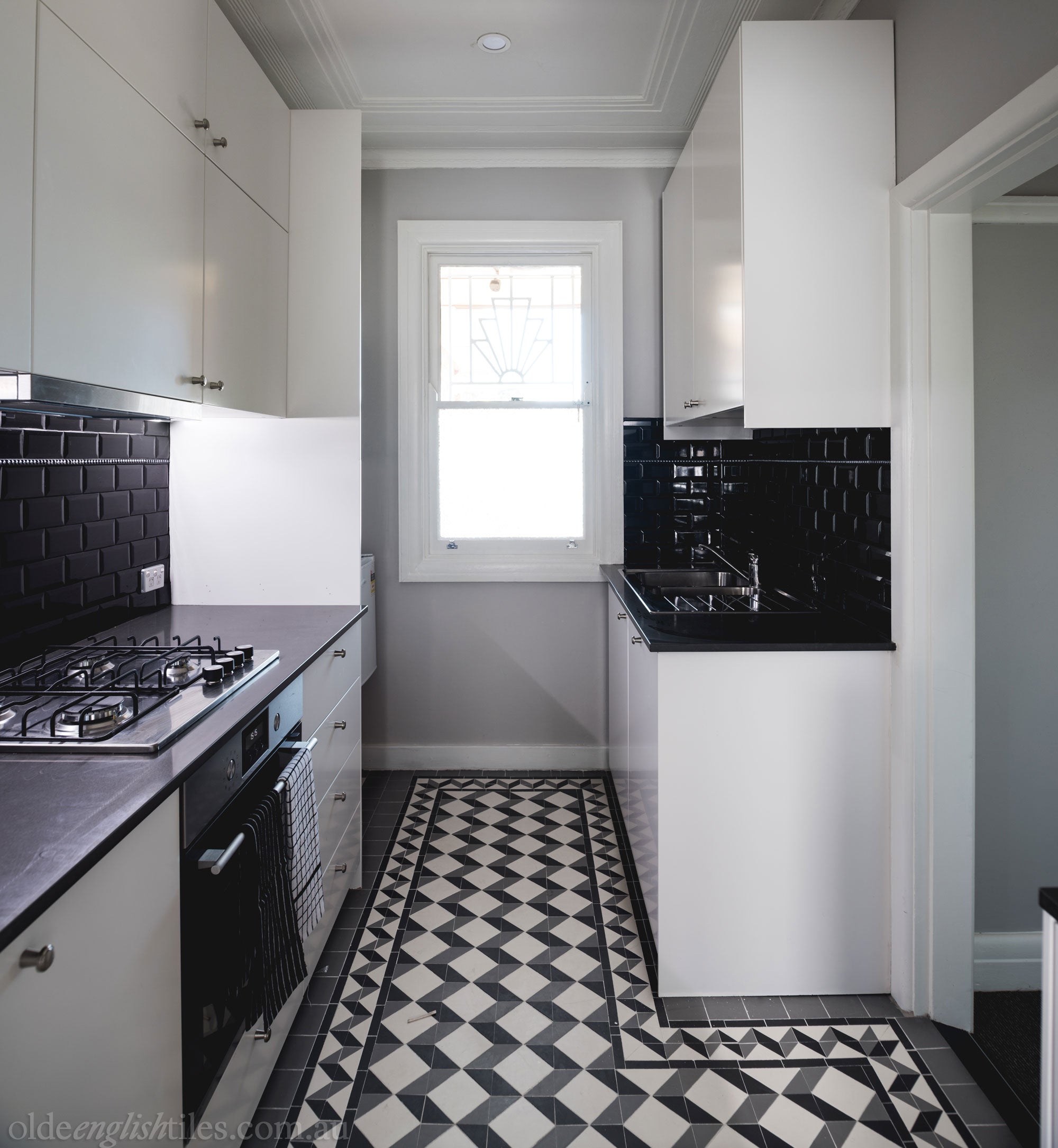
The shape and size of today’s kitchens can be infinitely varied. It may be the original space in a Victorian terrace at the rear of the house, or a large and airy transition point between the old structure and the new extension of a Federation cottage. Such open plan designs mean that the kitchen is, in reality, an extension of the living/family room, therefore the choice of pattern can be conceived on a much larger scale.
Alternatively, tessellated panels can be incorporated within areas of plain tiles creating a ‘rug effect’ to demarcate different zones of activity. Enjoying a more casual, relaxed and practical feel than any of the other rooms of the house, the choice of pattern for the kitchen floor should be equally practical and relaxed.
Suitable options for this area are plentiful: the Annandale, Paddington, Chester, Devon, Windsor, Brighton, Liverpool and Leeds are all worth considering whether you have a Victorian or Federation home. (See Pathways/Verandahs for guidelines on appropriate colours.)
Though not an obvious choice, spare a thought for mosaics in this area. There is a reason why, for example, so many busy restaurants and cafes in Italy, France and New York have porcelain mosaic floors - they work!
There are plenty of patterns, shapes and colours in the Classic Collection that will work for Federation through to Deco kitchens.
Laundry:
The laundry may sometimes double as a spare bathroom or powder room; it may be the primary transit room to the garden, therefore it needs to have a floor that is tiled with tough, durable, slip-resistant and easy maintenance tiles. It goes without saying that it should look good too, but nothing too fancy - a Bath, Olde English 100, Raglan or simple mosaic pattern are all ideally suited to this area.
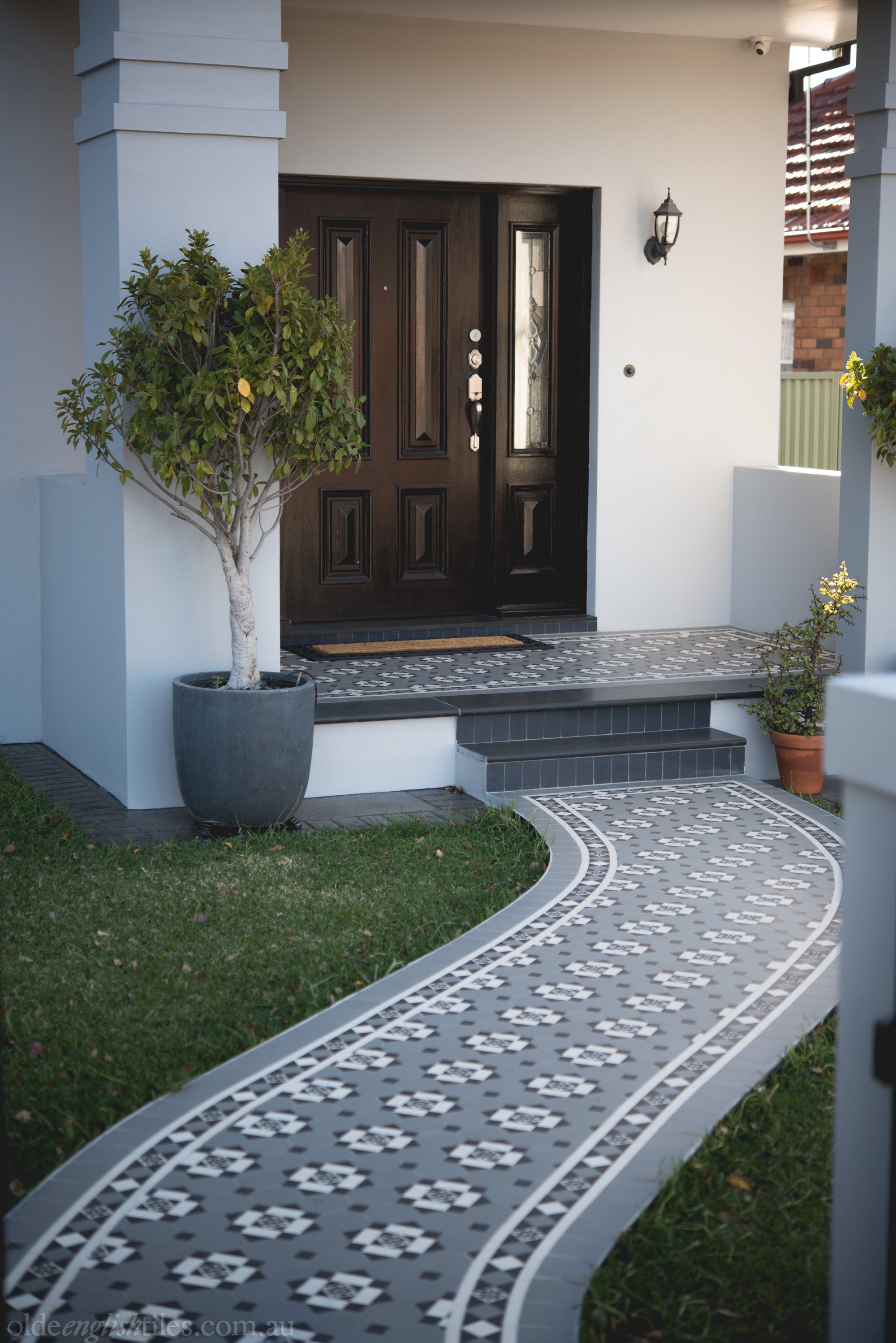
Back Verandah/Garden Path
As with the front path, the width and shape of the garden path should be taken into consideration when choosing a pattern and border, particularly where the path is curved.
Patterns that are less complicated with large repeat, such as the Paddington, the Nottingham & the Windsor are well suited to large spaces. Another option is tessellated panels surrounded by plain tiles. And just as with the laundry, simplicity, durability, ease of maintenance and safety are the key practical considerations for these areas. Tessellated floors of vitrified porcelain tick all these boxes.
This article has been written to assist you make an informed decision when looking for floor and wall tiles for your period home. It is not meant to be comprehensive, but only to give you a useful starting point, to help establish the parameters of your selection. Neither is it meant to be prescriptive. As the article says,
”If you understand what the rules are, you will know how to bend or break them to achieve the best result.”
For further information regarding selecting the right tiles for your project, make an appointment with a design consultant in our Sydney or Melbourne showroom. If you live outside these cities, please connect with us to discuss your project.
Of course, Olde English Tiles has an expert team of tilers to install your tessellated floor once you have finalised your selection. You can arrange an onsite inspection after talking to your consultant in store.